What is Leading Space
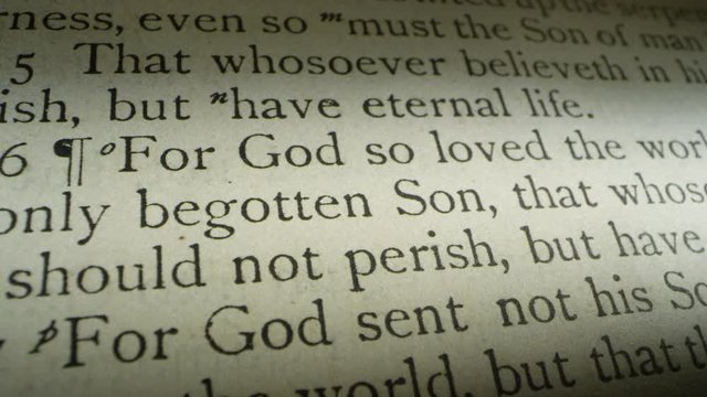
In biblical typesetting, leading (pronounced “led-ing”) is the vertical white space between lines of text. It is a critical design element that significantly impacts readability; more leading makes it easier to follow each line, reduces eye strain, and creates a more comfortable reading experience.
Key aspects of leading in Bible design include:
- Proportionality: Leading is usually proportional to the font size. Larger font sizes result in greater leading, which increases the amount of white space within paragraphs.
- Readability and Journaling: Increased leading, often combined with wide margins (such as one-inch side margins), provides ample room for writing, circling, drawing, and highlighting. This makes high-leading Bibles popular for journaling and study.
- Visual Clarity: Proper leading helps distinguish individual lines, preventing text from appearing crowded. This is particularly important in large print Bibles, where generous leading ensures that the larger type does not feel overwhelming or difficult to track.
- Line Matching: Consistent leading aids in “line matching,” the process of aligning text on both the front and back of a page, which reduces ghosting (print showing through) and makes the white space appear brighter and larger.
PROCEDURE TO DETERMINE FONT SIZE WITH LEADING SPACE
Choose a column that contains the same spacing for each line from top to bottom
Measure baseline (bottom of font) from the top line to baseline to last line in millimeters
Divide mm height by number of lines
158mm / 59 lines = 2.678mm
Convert mm to inches
2.678mm / 25.4mm = 0.1054 inches
Convert inches to points [72 points per inch and 25.4 mm per inch]
RESULT: 0.1054 inches x 72 = 7.5888 point font
Schuyler RSV Quentel with Apocrypha

182 / 45 lines = 4.04mm
4.04mm / 25.4 = 0.15923
0.15923 x 72 = 11.8 point font (Includes the leading or space between the characters)
Published font by Schuyler: 10pt Milo
The smallest font that I am able to comfortably read for extended periods of time is 8.2pt on 8.5pt Lexicon as published by Cambridge in the ESV Diadem edition. However I prefer the example from above as published by Schuyler in the RSV edition.
Here are some examples of Bibles I currently own
The first font size is the publisher’s reported size, the second is my finding that includes the leading space.
Cambridge NRSV w/ Apocrypha = 9-pt / 9.3-pt
Cambridge ESV Diadem = 8.25 / 8.4-pt
Cambridge Topaz = 10-pt / 10.8-pt
Schuyler ESV Stridon = 9.5-pt / 11.1-pt
Schuyler RSV Quentel w/ Apocrypha = 9-pt / 11.4-pt
Crossway ESV Study Bible = 9-pt / 9.9-pt
Crossway Heirloom Veritas = 9.25-pt / 12.45-pt
Crossway Heirloom Alpha = 8-pt / 9.2-pt
Crossway Thinline Red Letter 2025 = 9.73 with leading
Cambridge KJV Concord = 8-pt / 9-pt
Cambridge NASB Clarion = 8.75-pt / 10.5-pt
New Oxford Annotated Bible RSV with Apocrypha = 10-pt / 10.13-pt
Thomas Nelson NKJV Single Column VBV 2025 = 9-pt / 9.98-pt
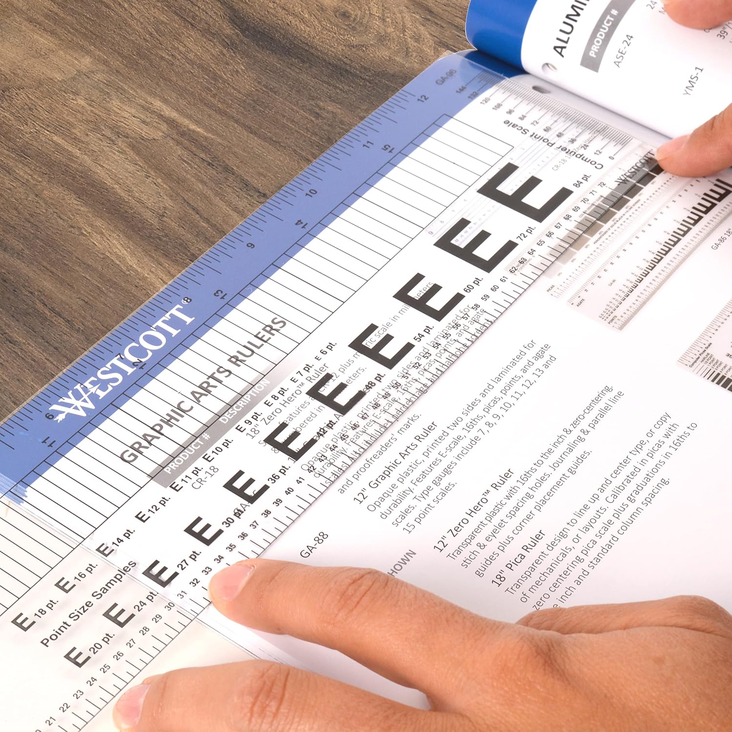
A resource that is quite helpful in determining font size is a Point & Pica Ruler. You cannot trust the published font size of publishers when it comes to bibles. I have compared hundreds of bibles with the publisher and find most are not accurate. I find that Schuyler is generally the best and Thomas Nelson used to be the worst but they have gotten better over the years.
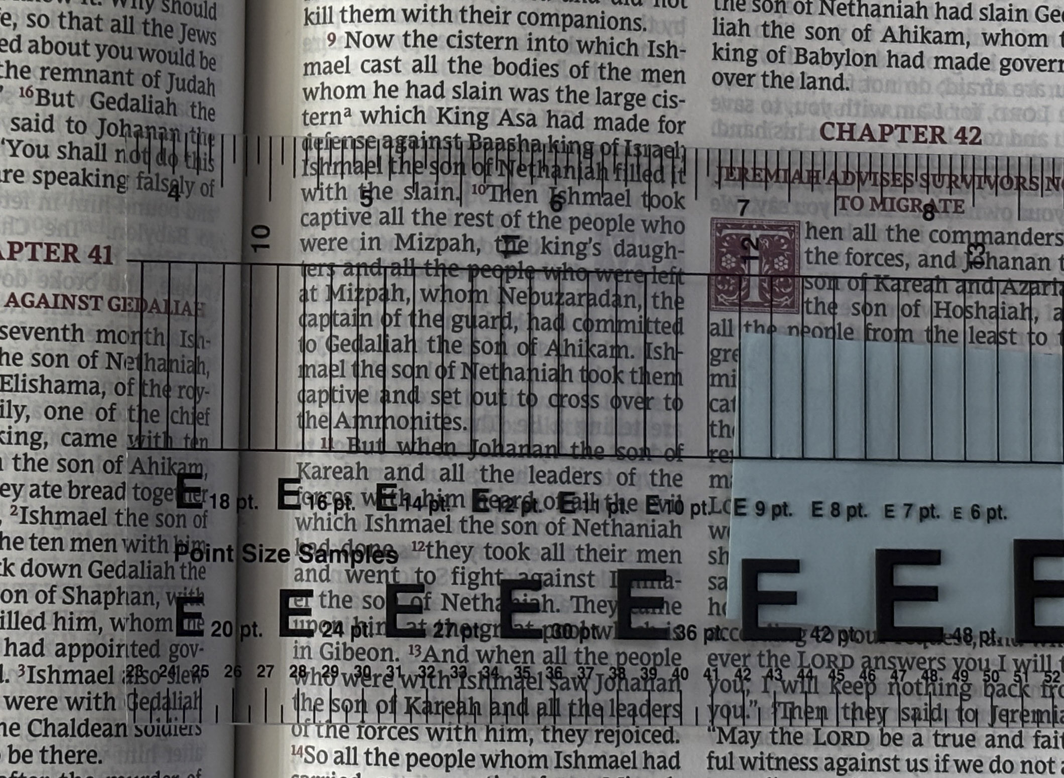
This point and pica ruler can be found at Amazon with the following link: (as usual, this website is a personal blog and EVERYTHING on my site is free to any user. I do not use affiliate links either.)
Westcott GA-96 Computer Point & Pica Ruler, Transparent Graphic Arts Ruler, 12 Inch